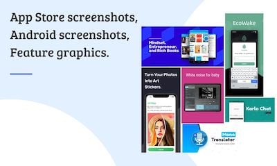
What is the feature graphic?
Feature graphics are images for highlighting Android apps on Google Play. While they are not mandatory, they are highly recommended since they are required for featured placement on Google Play. Even without featured placement, feature graphics offer incredible potential for developers and marketers. Think of them as free ads to attract users and entice downloads. From the Android Google Play guide:
"The feature graphic is the first thing your potential users see when they open your app’s store listing. On the majority of Android smartphones and tablets, it occupies a third of the screen. As a result, it can have a significant impact on a store visitor’s decision to download your app and is an important part of your app marketing. When you include a video in your store listing, the feature graphic provides a link — indicated by an overlaid play icon — so the user can start watching it straight away."
This tutorial helps you create a compelling feature graphic for Google Play within minutes.
To create Google Play feature graphics, start with one of these Hotpot feature graphic templates.
If you are on a budget and need free graphics, please see here.
Feature Graphic Size
1024px x 500px is the required size for a Google Play feature graphic.
File Format
The Google Play Store accepts either JPEG or 24-bit PNG (no alpha) images.
Best Practices
Create Interest
Treat the feature graphic like a billboard ad on the highway. Assume users will only glance at the feature graphic for a few seconds. The objective is to engender interest within this tiny window, to induce users to pause and explore the app listing further. The objective is not to explain the app in one graphic but merely pique interest.
Complement Brand
Use fonts, colors, graphics, and language that complement your brand. For instance, if you include your app logo, pick colors for the feature graphic that complement your logo. If your app projects fun and youthfulness, use appropriate language in the copy. Ultimately, the design of the feature graphic should seamlessly blend in with your brand and app.
Billboard Test
Like highway billboard ads, the feature graphic should rely heavily on arresting graphics and colors to capture attention. Use text sparingly. Google web ads limit each line of copy to roughly 30-40 characters, and similar guidelines should apply to feature graphics. Grab user attention with visuals, not text. If possible, aim to restrict the text to the app name and maybe a key phrase or two. When including text, remember to use font sizes large enough for the text to remain legible across device sizes.
As a test, show your feature graphic to someone for 5 seconds then take it away. Can the user recall the purpose of the app? If not, simplify the content until the app's main concept can be understood within 5 seconds.
Localize
If you're targeting multiple countries, localize your feature graphic with relevant languages so users can more easily understand your app.
Temporalize
Each new feature graphic offers a new way to attract users and highlight the benefits of your Android app. Change the feature graphic for special occasions like Christmas or Valentine's Day, or different promotions, events, or marketing campaigns linked to your company.
Feature Graphic Examples
Hotpot makes it easy to generate feature graphics. Explore our gallery of templates to get started, or view this list below for examples of compelling feature graphics.
Example 1
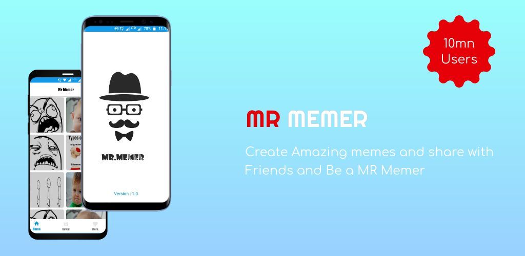
This example uses two app screenshots, framed inside modern Android devices, along with relevant and lively text to capture the user's attention. The other components are the app title, a brief app description, and accent text to highlight the number of app users.
Example 2
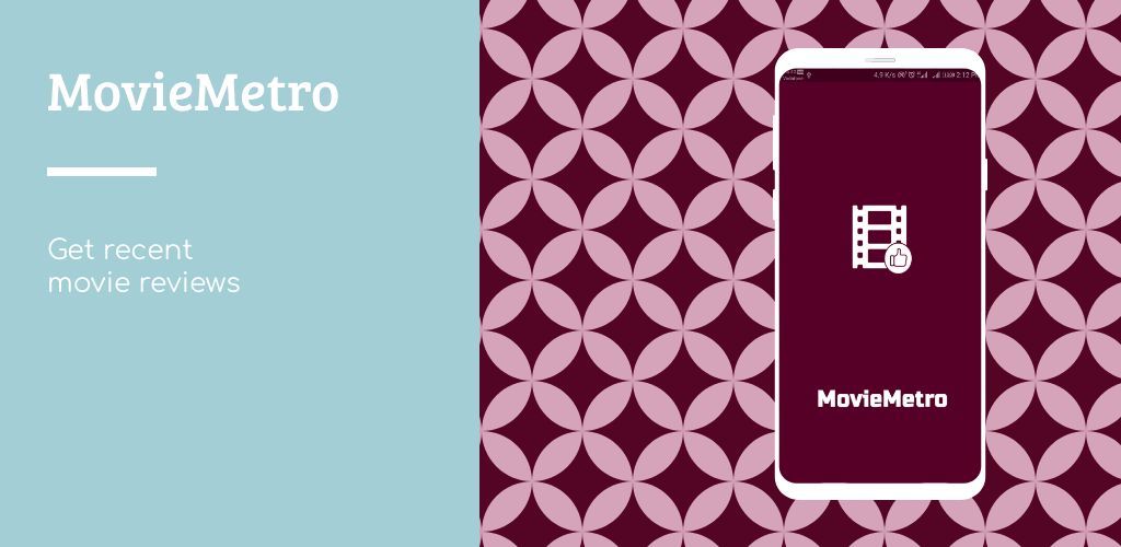
This example takes inspiration from popular Instagram layouts, displaying the app on the right side inside a Samsung S9 frame. On the left side, the app name is presented with a larger, more noticeable font, while the brief app description sits right below for a clean but impactful feature graphic. This feature graphic relies on a bold, attractive background graphic on the right, contrasted with a pastel background on the left.
Example 3
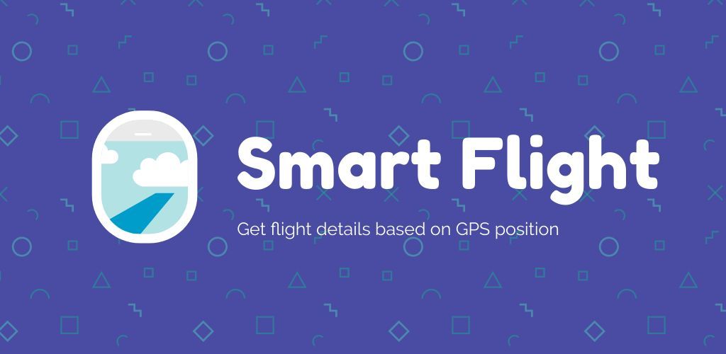
This feature graphic adopts a simple approach and only shows the app name, app slogan, and app logo. It grabs attention with a fresh, inviting color palette and a subtle background pattern while managing to retain focus on the app logo and app name.
How to Generate a Feature Graphic for Google Play
Hotpot makes it easy to create feature graphics like the examples above. Follow these steps:
- Browse the Hotpot templates for Google Play feature graphics.
- Decide what benefits to highlight or what emotions to evoke in prospects. What makes your app unique? What excites users? How does your app help users? Per the guidelines above, you want to limit text in feature graphics, so invest sufficient time to distill your marketing message into its essence.
- Pick the Hotpot.ai template most consistent with your brand or style. If none exist, create one from scratch.
- If you're including device frames, load the template, and click on each device frame. Use the Screenshot property to embed an app image automatically. The official requirements advise against device frames, but leading apps and companies use them regardless because end users are accustomed to seeing them and because of the design flair they add to feature graphics.
- Finish customizing the text, background, and other design elements.
- Download the Hotpot design, then celebrate like this wild user. :)


